
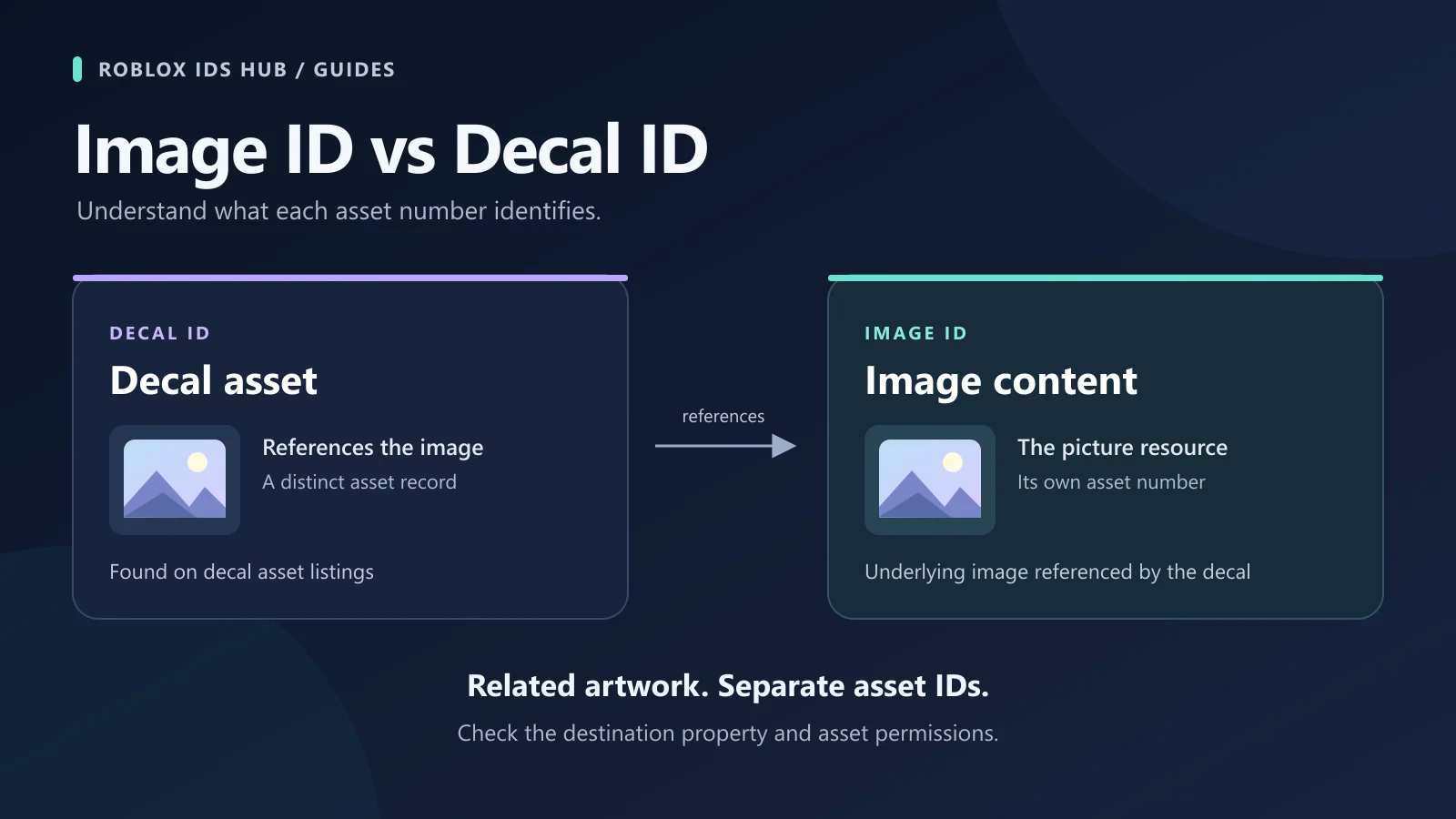
Before pasting an image ID into Roblox Studio, decide where the picture should appear. A poster on a wall, a repeating floor pattern, and a picture on the player’s screen use different objects.
Choose the object first, then assign the image reference.
What you want | Object to use | Image property |
|---|---|---|
One picture on a face of a part | Decal |
|
A repeating picture across a surface | Texture | Inherited |
A picture in a user interface | ImageLabel |
|
A clickable image in a user interface | ImageButton |
|
Find a resource you have permission to use in the image library or your own uploads. Start in a simple test place so you can confirm that the image loads before adding it to a larger build.
Prepare a small image test area
Create a simple area with one wall panel and enough space to view it from the front. Keep the first test separate from your finished room so furniture, effects, or other scripts do not make a basic display problem harder to spot.
Choose one image with a recognizable subject and record its source page. A design with a clear border or central object makes stretching and cropping easier to notice. Start with a resource you can use in the target experience; the ability to see a thumbnail is not a complete access test.
Name the wall and its image objects clearly in Explorer. When you add several objects named Decal or ImageLabel, it becomes easy to edit one while looking at another. Simple names such as PosterPanel and PosterImage make the following comparisons easier to repeat.
Before changing properties, decide what a successful result should look like. For a poster, the whole artwork may need to remain visible. For a decorative pattern, even repeats may matter more than showing a single complete source image. For a menu image, the subject may need to stay recognizable on a small screen.
1. Add a wall poster with a Decal
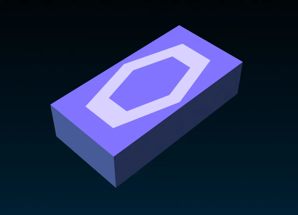
A Decal displays an image on a selected face of its parent part.
Create a Part and resize it into a wall or display panel. Anchor it for testing.
In Explorer, select the Part and add a Decal as its child.
Select the Decal and find Face in Properties. Choose the side that should display the picture.
Use ColorMapContent to select an image or enter the asset ID through the property’s asset-selection control.
View the part from the selected side and adjust its proportions to suit the artwork.
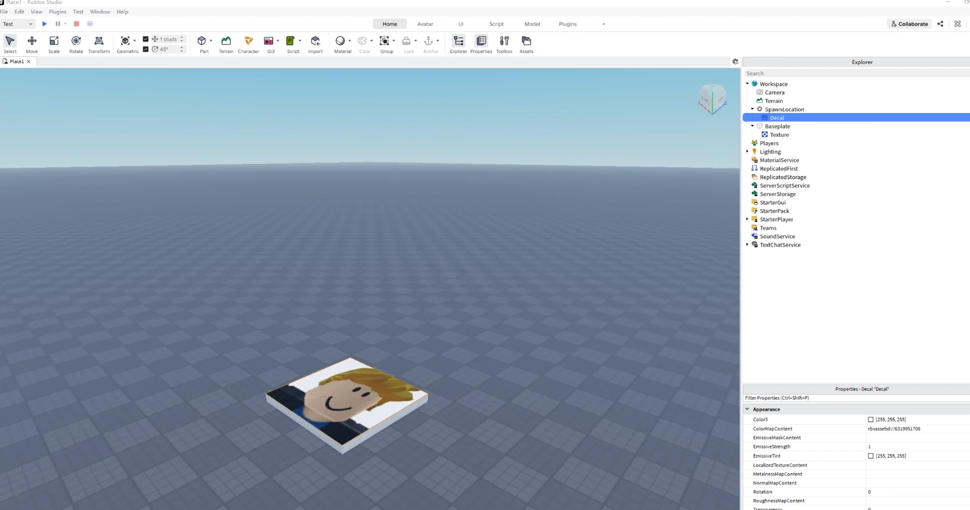

In this Studio example, the Decal is a child of SpawnLocation, a part in the scene. Its ColorMapContent references the image shown on the surface.
Roblox’s current textures and decals guide uses ColorMapContent. Older tutorials may refer to Decal.Texture; the Decal API reference marks that older property as deprecated.
If the picture does not appear, check the selected face and the Decal’s Transparency. If it looks stretched, compare the part face’s proportions with the original image before changing the ID.
Check the poster from the player’s viewpoint
After the first image appears, move the camera to where a player would normally stand. A poster that looks readable while you are editing close to the wall may be too small from the entrance to the room.
Keep important text and faces away from awkward edges in the display. If the artwork seems too wide or too tall, compare the source preview with the panel instead of compensating by changing several unrelated properties at once.
Then inspect the wall from the opposite side. This confirms which face you selected and helps distinguish a correctly placed front-facing poster from an image assigned to the side you did not intend to use.
2. Create a repeating pattern with a Texture
Use a Texture when the same image should repeat across a surface.
Add a Texture to the Part.
Select the face and assign the image through its image property.
Adjust StudsPerTileU and StudsPerTileV to control the width and height covered by each repeat.
Adjust OffsetStudsU and OffsetStudsV to move the pattern across the surface.
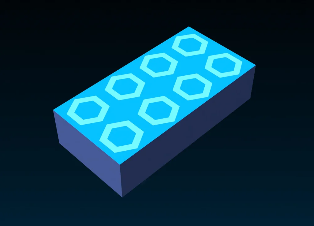
Smaller tile dimensions produce more repeats over the same area. Larger dimensions make each repeat cover more of the surface. These controls are listed in the Texture reference.
An image that can repeat is not necessarily seamless. Place several repeats next to one another and look for visible edges. If the border creates a distracting seam, use a different source image or display it as a single decorative panel.
Texture: repeated across the surface | Decal: one picture across the surface |
|---|---|
 |  |
Make two copies of your test panel and change only the tile dimensions. On one, use a larger pattern; on the other, show more repeats over the same area. Leave the panels at equal size while comparing them.
Watch details that could become distracting: repeated lettering, a recognizable object appearing too often, or a border forming a visible grid. A texture can be technically correct and still be a poor match for a large wall.
For a floor or long corridor, inspect the pattern while moving through the space. Repetition that looks subtle in one still view can become more noticeable across a larger surface. Choose the tile size based on the actual area and viewing distance.
3. Display a screen image with an ImageLabel
For a picture in the player’s interface, use an ImageLabel inside a ScreenGui.
Add a ScreenGui under StarterGui.
Add an ImageLabel under the ScreenGui.
Set a visible Size and Position so the image is easy to locate during testing.
Set BackgroundTransparency to
1if you do not want the element’s background rectangle.Assign the picture through the image picker or set Image to
rbxassetid://followed by the asset number.Keep ImageTransparency at
0and start with ScaleType = Fit.Press Play and check the image in the player’s interface.
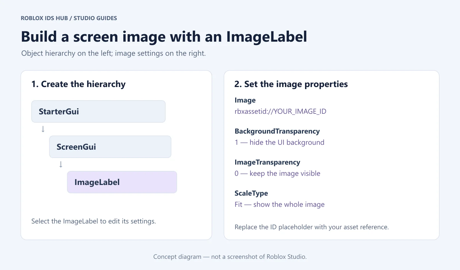

The diagram summarizes the object hierarchy and settings; it is not a screenshot of the Studio interface.
Fit is a useful starting point for seeing the whole composition. Crop fills the display area while potentially cutting off edges. Stretch adapts the image to the element’s dimensions, which can distort it when their proportions differ. See the ImageLabel reference for its image and scaling properties.
Check faces, text, and important objects near the image edges after changing the scaling mode.
If you want a GUI image on an object in the 3D world, use a SurfaceGui instead of treating every image as a screen overlay. Roblox’s label tutorial covers both screen and part-surface placement.
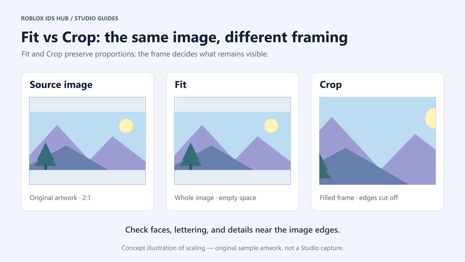

Keep image proportions consistent across window sizes
Test the interface in a tall and a wide viewport. The same picture can be clear in one arrangement and awkwardly cropped in the other if its container changes shape.
If the container itself needs a fixed ratio, consider a UIAspectRatioConstraint. Roblox’s size-modifier guide documents constraints for controlling UI proportions. A constraint governs the element’s shape; the image’s scaling mode still determines how the source content fits inside that shape.
Avoid judging the picture only while the Properties panel is open and the viewport is unusually narrow. Check the actual Play view, including whether text or controls overlap the image when the available space changes.
Choose between a Decal and a SurfaceGui for wall displays
A single image on one face may only need a Decal. A wall display that combines an image, a title, and interface elements may be easier to organize as a SurfaceGui with child GUI objects.
For example, a gallery sign could place artwork above a separate text label. Keeping the title as text makes it easier to change without replacing the source image. It also lets you adjust the label independently when the artwork changes proportions.
Check the SurfaceGui’s selected face and the size of its child image. If nothing appears, inspect the parent hierarchy before assuming that the asset number is wrong. Build one working display before duplicating it around the room.
4. Make an image-based button with an ImageButton
An ImageButton displays image content and supports button interaction. Set its image similarly to an ImageLabel, then connect the action you want it to perform.
For example, an image can represent a menu, inventory, or settings button. Assigning the picture alone does not implement opening a panel or changing a setting.
Check the button’s hover and pressed appearance as well. If you use HoverImage or PressedImage, make sure the icon remains recognizable in each state. The ImageButton reference lists these properties.
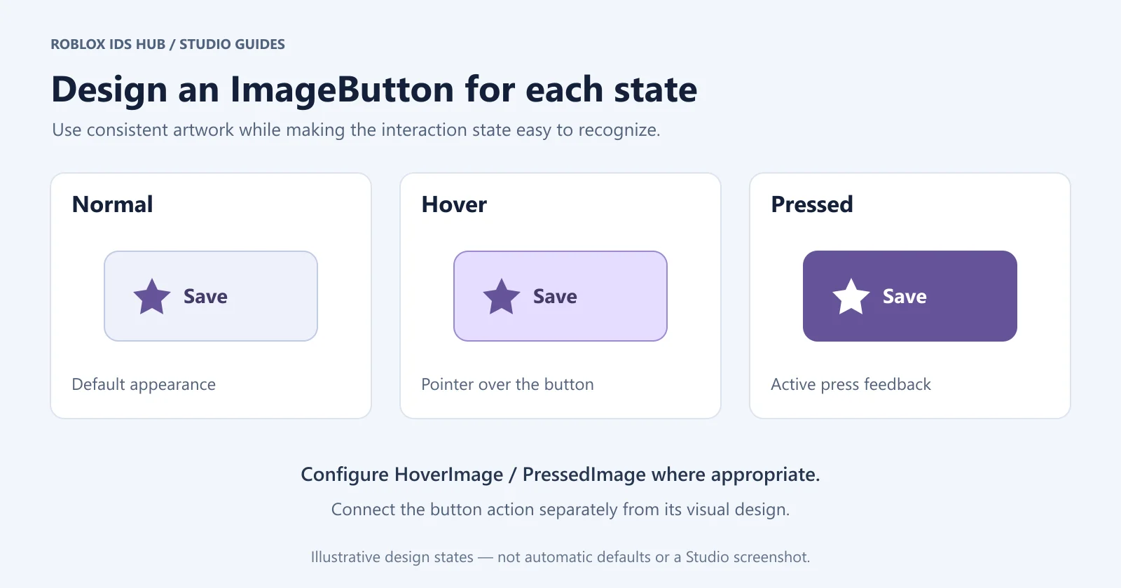

These are example state designs, not automatic default appearances. Configure the visuals and connect the button action for your own interface.
Set an existing ImageLabel’s properties in a script
For a script that already has a reference named imageLabel, the assignment looks like this:
imageLabel.Image = "rbxassetid://YOUR_IMAGE_ASSET_ID"
imageLabel.ScaleType = Enum.ScaleType.Fit
imageLabel.ImageTransparency = 0
Replace YOUR_IMAGE_ASSET_ID with the numeric ID you intend to use. This is a property-assignment snippet; it does not create the UI object or define imageLabel.
Properties whose type is Content need a Content value according to their API. Do not assume every image property takes a plain string in a script.
Practice with one picture in three places
Use the same resource for a short comparison exercise. This helps you see which differences come from the display component rather than from the artwork itself.
Build a wall print
Place the picture on a single panel using a Decal. Adjust the panel until the composition looks intentional, then view it from the room’s entrance. Check the selected face and whether the image is readable without moving unusually close.
Build a screen card
Display the picture in an ImageLabel inside a simple interface. Start with Fit, then compare Crop. Keep the container size unchanged so you can see exactly what the scaling mode changes.
If the picture contains a character, check the head and hands. If it contains text, check whether any words disappear. The mode that fills every edge is not automatically the best choice for the content.
Build a repeated surface
Assign the same resource to a Texture and inspect the joins. This deliberately tests whether an image suited to a poster also works as a pattern. If it does not, keep it as artwork and select a separate repeating design for the surface.
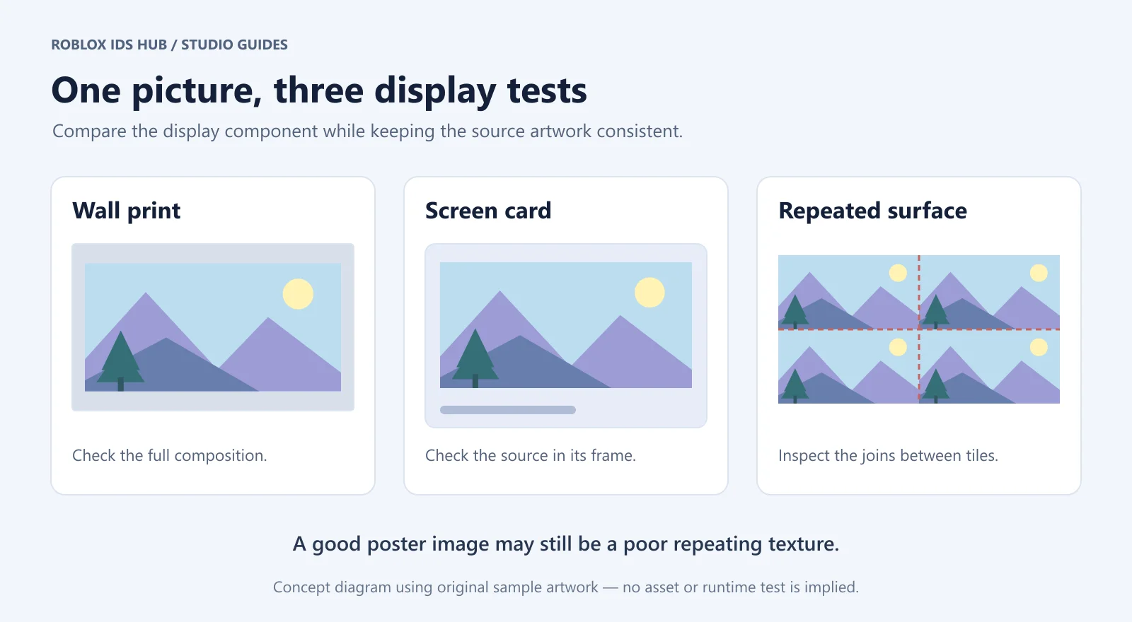

The original sample artwork illustrates the exercise; it is not a claim that a particular Roblox asset has passed these tests.
Fix blank, stretched, or cropped images
Symptom | What to check first |
|---|---|
Nothing appears | Asset access, resource status, the image reference, transparency, and object hierarchy |
The image is stretched | The source image’s proportions compared with the part or UI element |
Important details are cut off | Scaling mode and the display area’s proportions |
A repeating pattern has seams | Whether the source image actually tiles seamlessly |
It appears while editing but changes during Play | Runtime layout, permissions, and scripts that change the properties |
For UI images, check more than one window size. For wall art, inspect the picture from both nearby and normal viewing distances. A clear thumbnail does not guarantee enough detail for a full-wall display.
Duplicate the working display carefully
Once the first display works, duplicate that setup and change one element at a time. Keep the object hierarchy intact while replacing the resource, then check its proportions again. A successful landscape layout may need adjustment when the replacement is a portrait.
If several copies unexpectedly show the wrong picture, select each visible object and inspect its actual reference. Check whether a script assigns the image during Play, rather than assuming that the value you changed while editing is the final runtime value. Clear names make it easier to find the component that needs updating.
Frequently asked questions
Do I paste the asset page URL or just the number?
Use the form requested by the input. A numeric asset picker, a string property expecting an asset URI, and a browser address bar have different roles. Copy the number from a reliable asset record, then format the reference for the property you are editing.
Why does changing the panel size change the picture?
The display area affects how the artwork is presented. A single stretched picture follows the surface or element it occupies, while a repeating Texture uses tile dimensions. Compare the object type and scaling settings before treating the change as a loading error.
Will an ImageButton perform an action as soon as I set its image?
It will display its image, but your intended behavior still needs to be connected. Test the visual and the interaction separately so you can tell whether a problem comes from the picture or the button’s action.
Can the same image be used throughout the project?
You can reference a suitable accessible resource in several places, but evaluate each use independently. A detailed wall print may not make a readable small icon or a seamless floor pattern. Keep the source reference consistent while adapting the display to its purpose.
Start with one picture from the Background category, get it displaying correctly, and then expand the design to the rest of your build.