
A room does not need a different picture on every wall to feel coordinated. Start with a main color, choose one image that draws attention, and let the other decorations support it.
These nine Roblox image resources fall into three styles: cute illustrations, pink patterns, and preppy designs. Open an entry to inspect its preview and copy its ID. Individual experiences may accept different resource types, so test a single frame before decorating the whole room.
Cute image IDs for small frames and cozy corners
Resource | Roblox ID | Decorating idea |
|---|---|---|
CUTE DOG | A small picture featuring a white animal in a yellow cup | |
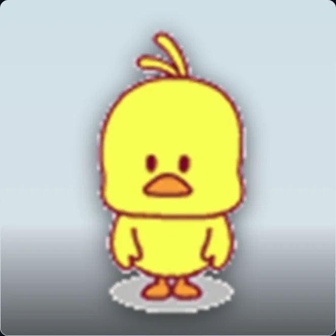
cute duck | A simple yellow cartoon duck for a playful corner | |
kawaii burger | A smiling food illustration for a cafe or dining area |
CUTE DOG | cute duck | kawaii burger |
|---|---|---|
 |  |  |
|
|
|
A warm accent: 166913332
The upload is titled CUTE DOG, but the visible composition is best described as a small white animal sitting in a yellow cup. The cup gives it a warm focal point that could suit a cozy desk area or a small framed print.
Leave some empty wall around it. A compact illustration is easier to notice when several neighboring pictures are not competing for attention.
A simple silhouette: 63455990
The yellow duck has a clear outline and a straightforward composition. Try it in a small frame near a play area, a casual hangout corner, or a bright display shelf.
Check it at the size players will actually see. A preview that fills your browser can look very different inside a tiny frame.
A playful food detail: 1108382932
This smiling food illustration can add a lighthearted detail to a cafe, snack counter, or kitchen-themed display. Match a few nearby colors rather than adding more unrelated food pictures immediately.
The ID refers to a flat image resource. It does not insert a 3D food prop into your scene.
Pink decal IDs for coordinated patterns
Resource | Roblox ID | Decorating idea |
|---|---|---|
pink aesthetic | A curved pale-pink grid for an accent panel | |
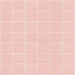
pink tiles | A regular pink grid alongside simple furniture | |
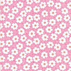
pink bloom | White flowers on pink for a small decorative area |
pink aesthetic | pink tiles | pink bloom |
|---|---|---|
 |  |  |
|
|
|
The curved grid in 1684193676 adds movement to an otherwise simple pattern. It can work as a standalone framed design or a small accent panel.
For a calmer arrangement, 5164241105 has more regular lines. Pair it with furniture that leaves the grid visible instead of crowding the surface with extra details.
5164240771 has a denser floral pattern. A small section can provide a decorative accent without making every surface equally busy.
These images offer wallpaper inspiration, but do not assume they are seamless textures. Place two repeats next to one another and inspect the joining edges before covering a large wall. If a seam is obvious, use a single panel or framed print instead.
Preppy decal IDs for bold accents
Resource | Roblox ID | Decorating idea |
|---|---|---|
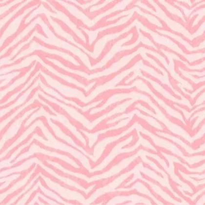
Pink preppy | Pink zebra stripes as a bold accent | |
Preppy decal | Pink-and-white lightning shapes on pale blue | |
preppy rainbow | A retro curved design with preppy lettering |
Pink preppy | Preppy decal | preppy rainbow |
|---|---|---|
 |  |  |
|
|
|
The pink zebra pattern in 7494139518 is a strong candidate for one focal area. Keep nearby surfaces simpler so the pattern has room to stand out.
7460952135 combines a pale-blue background with pink-and-white lightning shapes. Use the background color as a starting point for matching furniture or smaller accessories.
The curved design and lettering in 7236377158 make it more suitable as a themed print than a pattern repeated across every surface. Before using it in a small frame, check whether the lettering remains readable.
If you like all three, choose one as the main picture first. Pull supporting colors from that image instead of making all three equally prominent.
Three room schemes using this collection
You do not need to use all nine pictures together. Choose a small group around one room’s purpose, then decide which image leads and which details support it.
A cozy study corner with one cute accent
Start with the animal-in-a-cup picture, 166913332, as a small print above or beside a desk. Its yellow cup gives you a starting color for a nearby accessory, while the white subject leaves room for a calmer background.
Keep the largest surrounding surfaces simple. A neutral wall, one framed picture, and a small amount of matching color let the illustration remain the focus. If you add a second print, compare it with the first at the same display size before choosing a matching frame.
The duck can provide a brighter alternative if you want a clearer cartoon silhouette. Choose between those two directions first instead of filling every available frame. If the area is viewed from across the room, check which subject remains recognizable from that distance.
For a food-themed corner, swap in the smiling food illustration and repeat one of its colors near the counter. The room’s function then supports the image rather than leaving it as an unrelated decoration.
A pink room with a pattern hierarchy
Choose the regular pink grid, 5164241105, for a restrained decorative panel, then compare it with the more animated curved grid in 1684193676. Decide whether the room needs a quiet background or a more noticeable graphic accent.
If you also want flowers, use 5164240771 in a smaller area. Keeping the floral section smaller gives the two patterns different jobs. Covering equal areas with both can make it difficult to tell which design should attract attention.
Repeat a light pink tone in nearby objects, but allow some surfaces to remain plain. White or another quiet supporting color can separate the patterned areas. Judge the result from the doorway as well as close to the wall: a pattern that looks delicate nearby may merge into a broad block of color at a distance.
Before extending either grid as wallpaper, check its edges in the actual display. A single well-proportioned panel is still useful if the source does not repeat cleanly.
A preppy feature wall with a blue accent
Use the lightning design, 7460952135, as the starting point for a light-blue and pink palette. Keep it in one clear focal position, then borrow a background color for smaller objects around the room.
Compare the pink zebra print, 7494139518, as a secondary accent rather than assuming that both patterns need the same amount of space. You might prefer one strong zebra panel with otherwise quiet surroundings, or a lightning print with just a small pink detail nearby.
The lettering in 7236377158 offers another direction. Treat it as a statement print, giving the words enough space to remain legible. If it becomes the main image, reduce competing patterned frames beside it.
Walk the route a player would take into the room. The design should still have a clear focal point before someone stands directly in front of the wall. If three images all demand attention, try removing one before adding more decoration.

AI-generated room concepts showing color balance and frame placement. The framed artwork is illustrative; these are not game screenshots or demonstrations of the listed IDs.
Choose frames that suit the artwork
Match the frame to the composition rather than forcing every image into the same shape. The right choice depends on what needs to remain visible.
Image feature | What to preserve | What to check in the frame |
|---|---|---|
One small central subject | The whole silhouette and some breathing room | Whether the subject becomes too tiny or is enlarged too far |
A repeating-looking grid | Even-looking lines and useful scale | Distortion, visible edges, and abrupt joins |
Dense flowers or stripes | The overall pattern rhythm | Whether the design becomes busy at room scale |
Lettering | Complete words and readable spacing | Cropped letters and text that is too small |
Start by showing the whole source. Then compare a tighter composition if the display allows it. With a character or animal, inspect ears, feet, and any objects near the edges. With lettering, read the words after the crop rather than relying on your memory of the original.
For a group of frames, consistent spacing can unify pictures that have slightly different compositions. They do not all need to be enlarged until their subjects occupy exactly the same area. Forcing that match can create unnecessary cropping.
Test your picture in the destination game
In Bloxburg or another experience that offers custom pictures, follow the game’s current instructions for the frame or decorating object. Enter the numeric ID where supported, then check the result before duplicating the decoration.
If the picture is stretched, try a display area closer to the source image’s proportions. If it does not load, check the accepted resource type, asset availability, and access requirements rather than trying neighboring ID numbers.
For your own Studio build, use a Decal for a picture on a part or an ImageLabel for a GUI image. Test the layout at the distance and size players will see it.
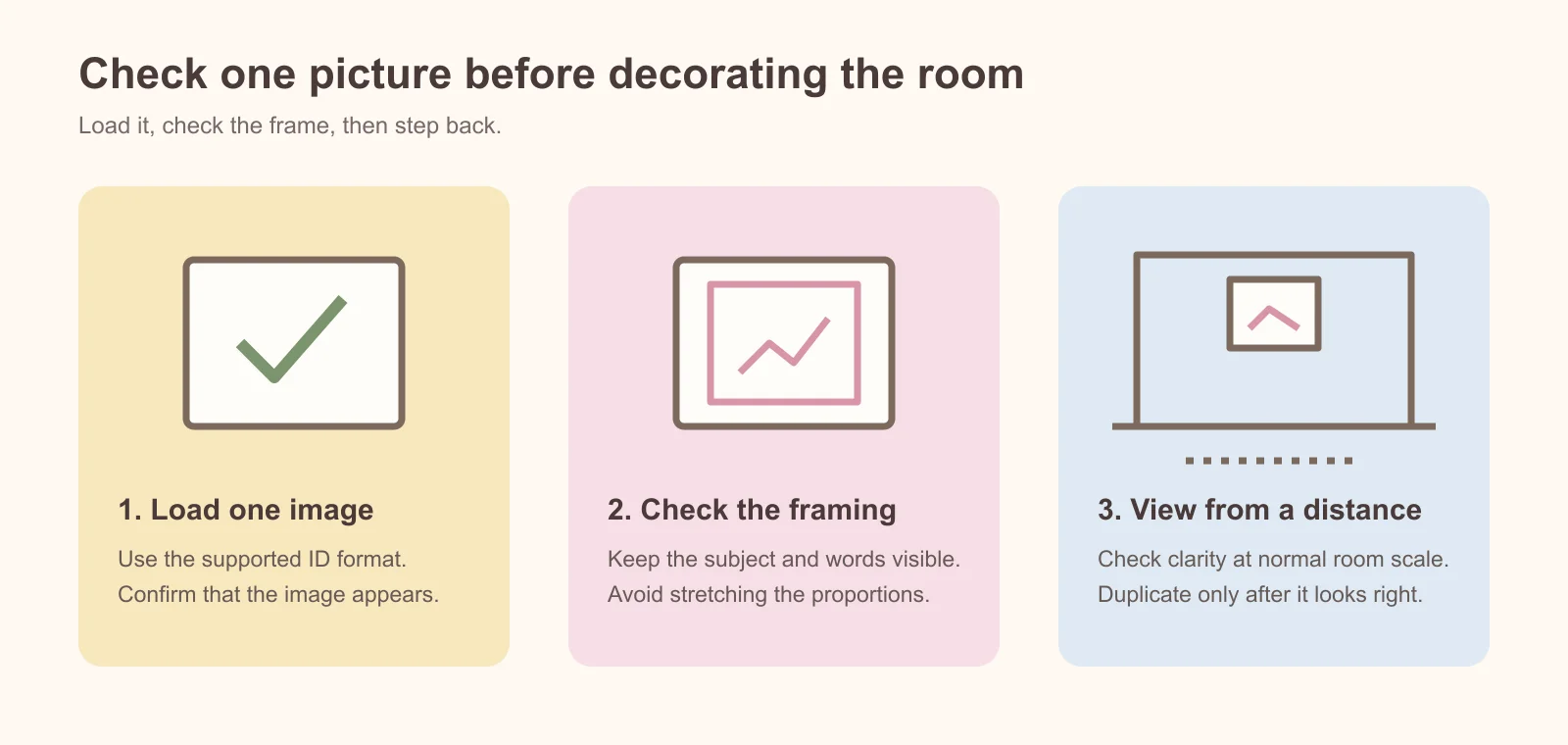
A decorating checklist diagram. Test the actual resource in your destination game or Studio project before duplicating it.
Check the result before decorating the whole room
Use one display to answer the basic questions first. Does the resource load? Is the whole subject visible? Is the image clear at a normal viewing distance? Only after that should you duplicate the setup.
If the result differs from the preview, describe the difference before changing anything. A stretched duck, a blurry pattern, and a blank frame are different problems. Changing the ID immediately can hide a layout issue without solving it.
What you see | First comparison to make |
|---|---|
The image loads but looks wide or narrow | Source proportions versus frame proportions |
The center looks correct but edges are missing | The display’s crop or fit behavior |
A pattern looks rough when enlarged | Source detail versus intended wall size |
Separate panels show obvious borders | The source edges and placement of adjacent panels |
Nothing loads | ID format, resource availability, and the game’s supported assets |
Keep an alternative picture that serves the same role. If a dense pattern does not work at the intended scale, another design with similar colors may preserve the room’s theme without requiring the rest of the decor to change.
Frequently asked questions
Can I use these IDs in Bloxburg?
Use the current picture feature and instructions provided by the game, then test each resource in a single display. A Roblox image listing is not a guarantee of acceptance by a particular game. If one picture fails, distinguish a resource problem from an unsupported input or decorating feature before replacing the rest of your selection.
Are these wallpaper codes or picture IDs?
They identify image-related resources. Whether you can use a picture as a wall panel, a framed print, or a repeating surface depends on the game or Studio component displaying it. A floral image does not automatically include a wallpaper tool or a seamless tiling version.
How many pictures should I use in one room?
Start with one main print and a small supporting group, then evaluate the actual space. A narrow desk corner needs a different arrangement from a long gallery wall. Let the room’s size and viewing distance guide the number instead of trying to use every ID in the collection.
Why does the same pink look different in my room?
Compare the picture in its actual surroundings. Adjacent colors and the way the display is presented can change the impression of a color. Use the rendered result when choosing matching objects rather than expecting a browser preview to settle every decorating decision.
Can I use one of these patterns behind interface text?
Try the image at the actual size of the panel with your real text visible. Fine flowers, zebra stripes, and lightning shapes can compete with small lettering even when they look attractive on their own. Check both short headings and longer labels, including areas where a bright detail sits directly behind a word.
If readability suffers, keep the artwork in a separate decorative region or place text on a simpler panel. A design that works on a framed wall print does not automatically make a useful menu background. Judge the combination rather than the image alone.
Can I mix cute and preppy images?
Yes. Give them a shared color or a consistent framing style, and decide which image should lead. A small duck print can coexist with a bolder pattern when their visual roles are clear. If the arrangement feels crowded, simplify the patterned surfaces first and compare again.
Find more images in the same style
Use image search with terms such as pink, preppy, or the name of an object you want. Inspect each preview: a matching keyword can also return hair, clothing displays, or face images that do not suit wall decor.
For more patterns and scenery, browse Background images. For a character-led room, explore Anime images.
Choose a small group, test it in one room, and expand from there. These are picture resources; copying their IDs does not change your avatar’s clothes, hair, or face, and it does not transfer rights to the artwork.